My First Project in Data Science.
*-lmage source
Exploring MTA Data for Optimal Street Campaigning
Blogpost by: Samy Palaniappan Teammates: Rita Biagioli, Stephen Schneider
Objective The objective of the project was to optimize placement of street teams, based on MTA Turnstile Data, to collect most signatures for organizing a fundraiser gala, in Summer 2020, to raise awareness about women in technology.
**-link to image site.
Assumptions
It can be safely assumed that placing street teams on stations that are heavily trafficked stations will give us the best opportunity to collect the most signatures. On weekdays, commuter traffic at MTA’s were considerably larger than the tourist commuters. Turnstile data for the periods between May 2019 and June 2019 is a good representation of the NYC resident commuters during summer, and will give us an idea of the number of residents that will be in the city during the summer.
Data
MTA turnstile data was obtained for the period, between May 2019 and June 2019, from the MTA website. The data contains the entries and exits for each turnstile recorded ever 4 to 6 hours, depending upon the station. Each row in the data corresponds to the data entry from a particular turnstile at a given point in time.
Approach
We took a two pronged approach to solve this problem. First, we explored the MTA turnstile data to identify the top 6 stations that have a heavy daily traffic. Once could then place their street teams at these locations throughout the day. In case of, minimal volunteer turnout, we focussed on the hourly traffic.
Secondly, we focussed on the NYC demographics to identify potential zip codes which have a high potential to contribute to this cause.
Methodology
Used Python as the programming language for this project, Pandas and Numpylibraries to process the dataframes, Matplotlib, Seaborn, and Folium libraries for generating the plots. The data was cleaned - by removing the duplicate entries and outliers.
Results
The top 6 stations that showed the highest number of entries on the days explored is shown in the Table 1. Figure 1, shows the box plot of the variation in the data. It can be seen that the variability in the number of entries data is not significant.
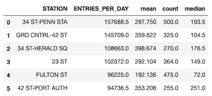
Table 1. Top 6 MTA stations, that recorded the highest daily entries in the period between May 2019 and June 2019.

Figure 1. Box plot showing a summary of the daily entries for the top 6 stations in NYC.
Figure 2. Shows the locations of the top 6 heavily trafficked stations, based on (A) exits in the morning and (B) entries in the evening. It can be seen that all the 6 stations are in the Manhattan region of NYC. This makes sense as it is the borough with the highest population. It can also be observed that, the exit turnstiles were heavily trafficked during the morning, while the entry turnstiles were heavily trafficked during the evening hours. The stations corresponding to the heavily trafficked entry turnstiles in the evening and exit turnstiles in the morning are the same. This can be explained from the fact that the most offices are located around these stations. Therefore during the day thus people going to work are leaving these stations, use the exit turnstiles. While, in the evening, people are going back home from these locations, use the entry turnstiles.
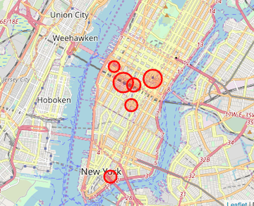
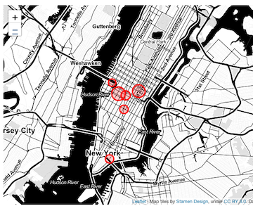
Figure 2. Map of NYC indicating the location of heavily trafficked stations. (A) shows the stations that recorded the highest exits in the morning and (B) shows the stations that had the highest entries during the evening. The size of the bubble is directly proportional to the daily total number of people using the turnstiles.
From Figure 3, it can be seen that weekdays recorded the highest MTA riderships correspond, while the weekends saw a lower traffic.
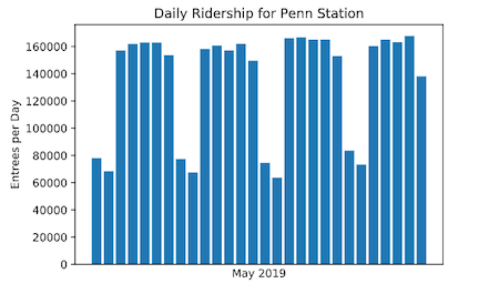
Figure 3. shows the fluctuations in the daily ridership for Penn Station during the month of May 2019.
Table 2, shows the top 6 highly trafficked stations on a 3 hour basis.

Table2. Optimized list of stations showing the highest hourly metro ridership in the period between May 2019 and June 2019.
Conclusion
In case of a bigger volunteer turnout, we suggest that street canvassing teams be placed at the top 6 locations on weekdays at all times during the day. Alternatively, for a low volunteer turnout we would advice a mobile team that would move every 3 hours, depending on the hour, to the station listed in Table 2 on a weekday.
For more information on the impact of demographics on the allocation of campaign resources, please see my team mate Rita Biagioli’s blog
Appendix A
 Figure A1. showing the fluctuation of traffic for every 3 hours on a weekday, for the top 6 stations discussed in the main text.
*- Title image was borrowed from NewYorker magazine. **-Image was borrowed from Thrillist.com(https://www.thrillist.com/lifestyle/new-york/l-train-shutdown-nyc-mta-plan-alternative-service)